
Style a material design card component with Tailwind CSS
Last modified March 3rd 2022 |
 Source Code [GitHub]
|
#tailwind
Source Code [GitHub]
|
#tailwind
Tailwind CSS is a low-level CSS framework that provides building blocks for creating your own custom designs. In this tutorial we’ll be using Tailwind to create a card component following the material design guidelines.
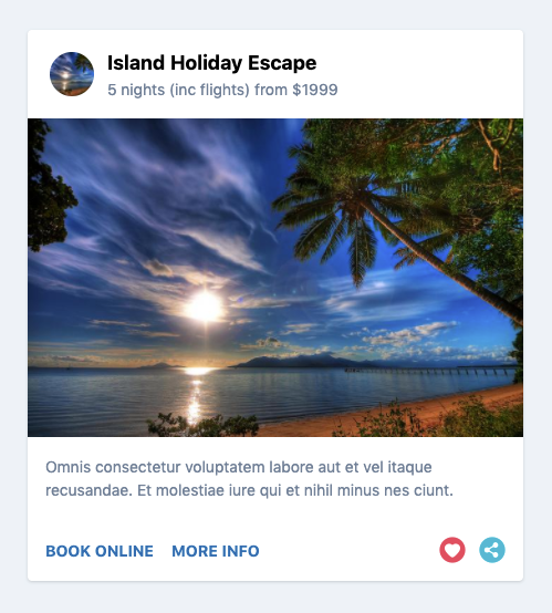
Once completed the component will look like this:
Let’s get started by creating a HTML template and loading Tailwind via CDN:
<!DOCTYPE html>
<html lang="en">
  <head>
    <meta charset="UTF-8" />
    <meta name="viewport" content="width=device-width, initial-scale=1">
    <title>Style a material design card component with Tailwind CSS</title>
    <link rel="stylesheet" href="https://unpkg.com/tailwindcss@^1.0/dist/tailwind.min.css" />
  </head>
  <body>
    <!-- Tailwind card component -->
  </body>
</html>Code language: HTML, XML (xml)
With Tailwind everything is written using low-level utility classes directly in the HTML not in a seperate CSS file. Let’s now create a HTML wrapper <div> for the component with some basic Tailwind classes:
<div class="rounded bg-white shadow max-w-md mx-auto">
  <!-- header -->
  <!-- section -->
  <!-- footer -->
</div>Code language: HTML, XML (xml)
rounded bg-white shadow– rounded corners on a white bg with a drop shadow.max-w-md– sets the max width of the component as medium (28rem).mx-auto– applies margin auto on the x-axis so the component is center aligned.
Inside the wrapper <div> the first element will be a <header> with the following markup:
<header class="p-4">
  <img class="w-10 h-10 m-1 mr-3 float-left rounded-full" src="http://lorempixel.com/64/64/nature/5/" />
  <h3 class="text-lg font-bold">Island Escape Holiday Package</h3>
  <p class="text-sm text-gray-600">5 nights (inc flights) from $1999</p>
</header>Code language: HTML, XML (xml)p-4– adds 1rem of padding on all sides of the header.w-10 h-10– sets the width and height to 2.5rem.m-1 mr-3– applies and even margin with a larger override on the right margin.float-left– floats the image next to the textrounded-full– gives the square image a round appearance.text-lg font-bold– sets the font-size slightly larger than the base size and bold.text-sm text-gray-600– sets the font-size smaller than the base size and gray.
Next we’ll add the middle section that contains an image with supporting text:
<section>
  <img src="http://lorempixel.com/700/450/nature/5/" />
  <p class="text-sm text-gray-600 p-4">Omnis consectetur voluptatem labore
  aut et vel itaque recusandae. Et molestiae iure qui et nihil minus nes.</p>
</section>Code language: HTML, XML (xml)
Text styling and padding used here is the same as in the header for consistency. Images in Tailwind are responsive by default so no further classes are required.
To complete the component we’ll add a footer with a couple of CTA’s and some icons:
 <footer class="p-4">
  <a href="#" class="uppercase font-bold text-sm text-blue-700 hover:underline mr-3">Book Online</a>
  <a href="#" class="uppercase font-bold text-sm text-blue-700 hover:underline">More Info</a>
  <a href="#" class="float-right">
    <img src="https://img.icons8.com/flat_round/24/000000/share--v1.png"/>
  </a>
  <a href="#" class="float-right mr-3">
    <img src="https://img.icons8.com/flat_round/24/000000/hearts.png"/>
  </a>
</footer>Code language: HTML, XML (xml)
Text styling used here is pretty self explanatory. The only other thing required was to add float-right to the icons. For hover styles in Tailwind you need to be prepend the class with :hover. In this example we’re adding an underline on hover.
You should now have the knowledge to design your own card component from scratch using Tailwind. I’d recommend reading the official documentation if you would like to learn about all of the features available in Tailwind.
Related Posts
#AD Shop Web Developer T-Shirts


